

Ever landed on a webpage that felt like deciphering the tax code? It had six different fonts and colors that hurt your eyes. Plus, paragraphs longer than a congressional filibuster.
That digital wall of text isn’t just an eyesore—it’s driving readers away. When your content looks like a legal document from the 1800s, people bounce quickly.
Google might not officially grade your readability score yet. But they’re watching how real humans interact with your work. They track dwell times, scroll depth, and engagement rates closely.
Poor readability makes your content the digital equivalent of a party where everyone leaves after five minutes. Soon, you won’t get invited to the neighborhood potluck—or the search results page.
Good readability isn’t just about looking nice. It’s about surviving in the attention economy. Informed readers ready to convert are the ultimate prize.
Techniques for Enhancing Readability
Ever felt like you’re reading through fog? Let’s make your content clear. Think of it as a friendly chat, not a long lecture.
Choosing the right font is key. Fonts like Arial or Helvetica are great for digital content. They’re like the classic black dress of fonts – always a safe choice. Use only one or two fonts, unless you’re creating a circus poster.

Structure is vital. Headings guide readers through your content. Bullet points help break down big ideas. And don’t forget white space – it’s like a breath of fresh air for your reader’s brain.
Sentence length is important. Try to keep sentences under 20 words. It’s like writing for Twitter – keep it short and sweet. Short paragraphs are also a winner online, sometimes even a single sentence is enough.
Choose your words wisely for content clarity, not to show off. Avoid jargon like you would avoid a certain relative at family gatherings. If you need a thesaurus, your readers will too.
Online, people scan, not study. They look at web content like browsing Netflix – they want to quickly decide if it’s worth their time. Make your content engaging and easy to dive into.
Transition words are essential. They connect your ideas smoothly. Think of them as the social glue of your writing.
Use passive voice sparingly, like truffle oil in cooking. A little adds flavor, but too much spoils the dish. Active voice keeps your content lively and purposeful.
Always proofread with fresh eyes. Your brain will start to correct errors after too much staring. Take a break, come back, and read aloud to catch awkward phrasing.
These tips make your content easy to read and engaging. It’s not about making ideas simple – it’s about presenting them in a way that grabs attention and flows smoothly.
Tools for Analysis
Imagine having a team of digital editors working around the clock to polish your content. Welcome to the world of readability analysis tools. These tools guide your writing through confusing syntax and grammatical pitfalls.
Hemingway Editor is like that brutally honest English teacher we all remember. It calculates your Flesch-Kincaid Reading Ease score and highlights problematic sentences. The tool’s color-coded system makes complex writing issues instantly visible.
Grammarly is your personal writing assistant, scanning for grammar and spelling errors with precision. It’s valuable for UX design professionals who need to explain complex interfaces clearly.
For those in the UX design space, Positional’s SEO tool offers readability scoring. It measures reading ease and grade level based on sentence and syllable count. It gives your content a complete literary physical.
The Yoast SEO plugin is known for its obsessive-compulsive content analysis. It checks your writing against multiple criteria, including sentence length and structure variety.
- Sentence length and structure variety
- Paragraph length distribution
- Subheading frequency and placement
- Transition word implementation
- Passive voice percentage
- Consecutive sentence patterns
- Flesch reading ease score
These tools transform subjective writing quality into measurable data points. For UX design content creators, this means quantifying how accessible their explanations are to end-users.
The real magic happens when these tools work together. Hemingway identifies structural issues, Grammarly catches grammatical errors, and Yoast provides a UX design content strategy overview. It’s like having an entire editorial board at your fingertips.
While these digital editors can’t appreciate witty sarcasm or cultural references, they excel at identifying when your writing becomes confusing. For UX design professionals, this means creating content that users can navigate easily.
Real-world Examples of Success
Let’s play a game I call “Which Lawyer Actually Gets Clients?” Imagine you’ve had a minor car accident and need legal advice. Two websites pop up in your search.
The first site is easy to read, with clear headings and simple language. It feels like talking to a friend. The second site is hard to understand, filled with old-fashioned legal terms.
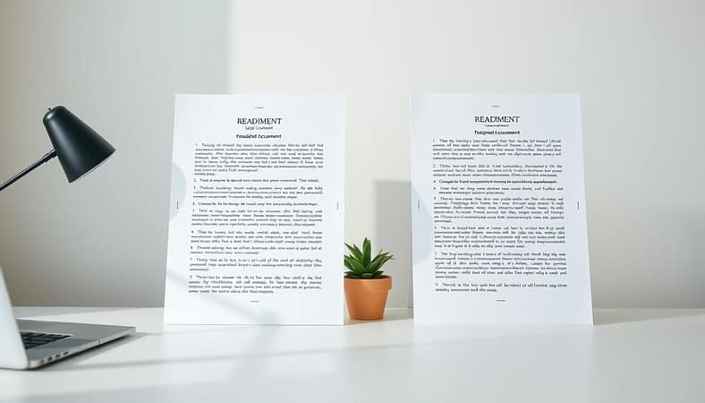
Which one keeps people interested? The easy-to-read site doesn’t just rank better. It performs better where it really matters. I’ve looked at data from personal injury law firms that made their content easier to read. The results are amazing.
The conversational content:
- Increased time on page by 3.7 minutes
- Reduced bounce rate by 42%
- Improved conversion rates by 28%
The site with hard legal terms, on the other hand, was a flop. People left quickly, like they were watching a TikTok video that didn’t interest them.
One firm changed their content from being like legal textbooks to useful guides. They didn’t make it simple for the sake of it. They made it easy to understand. And guess what? Their contact form submissions tripled in just three months.
This isn’t just about making people happy. It’s about the facts that show clear content leads to better business results. The data is clear: content that’s easy to get is better in every way.
Your content should be a helpful chat, not a test you need to pass. When people can understand what you’re saying, they trust you more. And they’re more likely to choose your services.
Strategies for Long-term Improvement
Think of content clarity as a marathon, not a sprint. It’s like having a friend who always tells you the truth, even if it’s a bit annoying. But, they always help you get better.
It’s time to accept the mobile-first world. Test your content on different devices as if it’s a new product launch. If it looks good on a smartphone, it will work on other devices too.
Learn from your competitors who rank well. Consider hiring an editor to help improve your content. It shows you value quality, just like Hemingway did.
Tools like Wordtune and Yoast are helpful, but not perfect. Don’t always follow their advice. Sometimes, longer sentences or passive voice are better.
The real goal is to make content that people enjoy reading. Write as if you’re talking to a smart friend, not trying to impress a search engine. This way, you’ll achieve lasting content clarity.