
You’ve worked hard on a piece, like Sisyphus pushing a boulder up a hill. But then it falls back down, ignored.
It’s not always the idea that fails. It’s how you present it. A big block of text is hard to understand. Good structure is key to making your ideas clear.
Good presentation helps readers stay focused. It keeps them from getting lost in too much information. This makes them stay longer and come back more often.
It also makes your content easy to read on phones, helps with search rankings, and is better for everyone to access. In short, it makes your content engaging.
The truth is harsh but real: nobody actually wants to read your content. But you can make them want to. That’s why formatting is so important.
Headlines, Subheads, & Lists
Your headline is like a Broadway marquee—it either draws a crowd or leaves the theater empty. You have just a breath of time to grab a scanner’s attention. A good headline promises something valuable, sparks curiosity, or names a problem. Vague headlines are the cardinal sin of online writing structure.
Once you’ve caught their interest, you can’t leave them in the dark. Subheads, or H2 and H3 tags, are essential. They guide readers through your text. A reader should quickly grasp your argument from your subheads. Does your formatting lead clearly, or confuse?
Respect the hierarchy of your content. Your H1 is the main title, H2s are chapter titles, and H3s are sub-sections. Skipping levels, like going from H2 to H4, is confusing. This structure helps search engines understand your content’s importance.
Lists are great in a world full of information. They offer clear, actionable takeaways. Bulleted lists break down complex points, while numbered lists guide through a sequence. Both make complex text easy to scan and understand.
| Feature | Bulleted List | Numbered List |
|---|---|---|
| Primary Use | Presenting related items, features, or options where order doesn’t matter. | Outlining steps, sequences, rankings, or processes where order is critical. |
| Visual Impact | Creates immediate white space and allows the eye to quickly capture multiple points. | Implies progression, priority, or a timeline, guiding the reader forward. |
| Reader Psychology | Suggests a collection of equally important ideas. It feels complete. | Creates an expectation of a journey with a clear beginning, middle, and end. |
Headlines, subheads, and lists are the foundation of your content. They provide the writing structure that supports your ideas. They answer the reader’s questions: “What is this about?” “Where is this going?” and “What do I need to know?” Master these, and you make complex ideas easy to grasp. Your formatting becomes a helpful guide, not an obstacle.
Chunking & White Space
Ever tried to read a legal document from the 18th century? It’s like trying to read a wall of text. Your brain isn’t a dump truck; it’s a curator at a museum. It needs information in small, easy-to-digest pieces.
“Chunking” is about breaking down complex info into smaller bits. Think of it like the difference between a Twitter thread and a Russian novel. For online writing structure, keep paragraphs short and focused. Aim for two to four lines max.
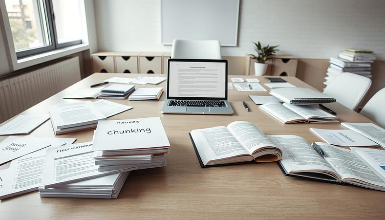
White space is another key element. It’s like the silence between musical notes. It’s not empty; it’s emphatic. Using generous margins and line-heights helps your content breathe.
This approach makes your content easy to follow. It’s like a minimalist gallery where each idea shines. This way, you avoid overwhelming your readers and keep their focus sharp.
| Aspect | Chunked & Spaced Page | Wall of Text |
|---|---|---|
| Visual First Impression | Inviting, approachable, organized. | Daunting, dense, requires effort. |
| Ease of Scanning | High. Key points jump out. | Very low. Information is buried. |
| Cognitive Load on Reader | Light. Brain processes in clear chunks. | Heavy. Causes fatigue and skimming. |
| Overall Readability Score | Excellent. Encourages full engagement. | Poor. Promotes early exit. |
The right writing structure is about more than words. It’s about the space between them. By using chunking and white space, you create an experience that values your reader’s time. This elevates your content’s readability.
Readability Tools
Looking at your own writing can be tricky. It’s like judging your haircut in a funhouse mirror. Your brain fills in gaps and misses snarls. That’s where readability tools come in. They’re like honest writing buddies you never knew you needed.
Grammarly and the Hemingway Editor are your tone police. They check more than just typos. Hemingway highlights complex sentences and passive voice. It uses colors to show you where to improve.
Microsoft Word has a built-in readability checker. It gives your text a grade level score. This helps you make your writing easy to understand for most people.
Readable.com offers detailed analysis. It scores your text on various readability levels. This helps you see where your writing needs improvement.
Numerous.ai is great for checking your document’s structure. It looks at headings, paragraph length, and more. It helps you make your content easy to scan.
| Tool | Primary Function | Key Metric Provided | Best For | The Quirk / Fun Fact |
|---|---|---|---|---|
| Grammarly | Grammar, tone, and clarity checking | Tone score, correctness score | Catching subtle errors and adjusting formality | Its browser extension can judge your social media posts in real-time. No one is safe. |
| Hemingway Editor | Simplifying and strengthening prose | Readability grade, adverb count, passive voice alerts | Making complex ideas fiercely clear and direct | Named for the author famous for concise prose. It actively discourages writing like Proust. |
| Microsoft Word | Built-in document analysis | Flesch Reading Ease, Flesch-Kincaid Grade Level | A quick, no-cost sanity check on overall readability | The feature has been hiding in plain sight for decades. Your old college papers were probably more complex than you thought. |
| Readable.com | Comprehensive text scoring | Multiple scores (Flesch, Gunning Fog, SMOG, etc.) | Data-driven content optimization for specific audiences | It can analyze text in real-time URLs, not just pasted content. The internet is its testing ground. |
| Numerous.ai | AI-powered document structure audit | Heading hierarchy analysis, density mapping | Optimizing long-form content formatting and scannability | It lives inside your spreadsheet, making data analysis and content analysis weirdly adjacent tasks. |
These tools aren’t meant to replace your creativity. They help you refine your writing. They offer a fresh perspective after hours of work.
Run your writing through these tools to see how it stacks up. The results will show you where to improve. You’ll know if your formatting is working.
Mobile-First Design
If your writing focuses on desktop screens, you’re writing for a dying medium. Over 60% of web traffic now comes from mobile devices. These devices are used for everything from ordering food to watching videos.
Your content faces stiff competition. It’s not just other articles. It’s up against a digital world in the palm of your hand.
Mobile-first design is essential. It’s not about shrinking desktop content. It’s about creating an experience that fits mobile screens perfectly.
Responsive design is key. Your layout should change smoothly on any screen size. This is done with CSS breakpoints and flexible grids.
Then, there’s the “fat finger” factor. Touch targets need to be at least 44×44 pixels. Buttons and links should have plenty of space. A bad tap can quickly turn a reader off.
Your content’s structure also needs work. Keep paragraphs short, two to three sentences. Subheadings help guide readers through the content. Every word should load quickly to keep readers engaged.
This approach changes how you design. Start with the smallest screen. Build the core experience there. Then, enhance it for larger screens. This ensures a solid experience for most users.
| Formatting Consideration | Mobile-First Priority | Desktop Enhancement |
|---|---|---|
| Paragraph Length | 2-3 sentences max; ultra-scannable | Can expand slightly, but maintain chunking |
| Touch/Target Size | Minimum 44x44px; ample spacing | Standard clickable areas are sufficient |
| Image Optimization | Compressed, fast-loading, critical above fold | Can use higher resolution versions |
| Navigation Structure | Hamburger menu; simplified, prioritized actions | Full horizontal nav bar with all options |
| Content Hierarchy | Single-column, strict visual flow | Potential for multi-column or sidebar layouts |
Testing is a must. Preview your work on real devices. Emulators are helpful but can’t replace the real feel of scrolling.
Does the text flow well? Are buttons easy to press? Is the main message clear without zooming?
The mobile world is full of distractions. Notifications and apps compete for attention. Your design must be smooth and engaging to keep readers.
In today’s world, capturing attention is key. A good design can keep readers engaged. A bad one can lose them quickly.
Accessible Formatting
Accessible formatting is like a sound system that lets everyone hear your ideas. It’s not about making special areas for some. It’s about making sure everyone can hear and see your message.
This isn’t just about helping others. It’s about making your content better. When you make your content accessible, you’re not lowering your standards. You’re making it better for everyone.
Let’s talk about color contrast first. That light gray text on white is hard for people with low vision to see. The Web Content Accessibility Guidelines say text needs a 4.5:1 contrast ratio. This is like adjusting the volume on your words.
Poor contrast is not just bad design. It blocks people from seeing your message. Use online tools to check your colors. Your words should be clear, not hidden.
Typography is also key. Some fonts are hard for people with dyslexia to read. Dyslexia-friendly fonts like OpenDyslexic, Arial, or Verdana are better because they have clear letter shapes.
Font size matters too. Text should be at least 16 pixels to be clear. Smaller text is like whispering in a loud room. This helps everyone see the structure of your writing.
Using semantic structure is important. H2 and H3 tags help screen readers understand your content. This lets blind users navigate your article by headings. Is your content clear and organized?
This structure is essential. It makes your text easy to follow. Using headings correctly is key to good writing structure.
Alt text for images is also important. It should be short and descriptive. “Chart showing polling data” is vague. “Line chart depicting a 15-point lead for Candidate A in Midwest suburbs from August to October” tells the story.
Link text should be clear too. “Click here” is vague. “Read the full Senate committee report” tells you what to expect. This makes your content easier to use.
Think of these guidelines as a way to design for everyone. Some people can’t read certain fonts or need high contrast. Others use their ears to read. You’re making your content accessible to all.
| Element | Best Practice | Why It Matters | Quick Check |
|---|---|---|---|
| Color Contrast | Minimum 4.5:1 ratio for text | Ensures text is visible to users with low vision or color blindness | Use WebAIM Contrast Checker |
| Font Choice | OpenDyslexic, Arial, Verdana | Reduces letter confusion for readers with dyslexia | Avoid decorative or thin serif fonts |
| Font Size | 16px minimum for body text | Prevents eye strain and improves reading speed | Never go below 14px |
| Alt Text | Descriptive, contextual explanation | Allows screen readers to convey image content | Describe function, not just appearance |
| Link Text | Clear, action-oriented phrasing | Helps all users understand where links lead | Avoid generic “click here” phrases |
The table above is more than just rules. It’s a guide to making your content inclusive. When you follow it, you’re not just being compliant. You’re making your content better for everyone.
Good readability is for everyone. It assumes your reader might be using a screen reader or viewing your site in bright sunlight. It’s about making your content clear for all.
Formatting with accessibility in mind is a test of your content’s strength. If it can’t pass these tests, was it ever clear? Make your content accessible to everyone. Fill every seat in your auditorium.
Visual Enhancements
Think of your text as a film. The words are the dialogue, but without a score, it’s just people talking. Strategic visuals are that score. They add the emotional cue, the dramatic pause, and the moment of awe that words alone can’t always provide. This isn’t about decoration. It’s about cognitive relief.
Our brains process images 60,000 times faster than text. A relevant, high-quality image isn’t a break from your argument; it’s an anchor for it. It transforms an abstract point into something concrete. Remember that infographic you saved last week? That’s visual storytelling winning over a data dump.
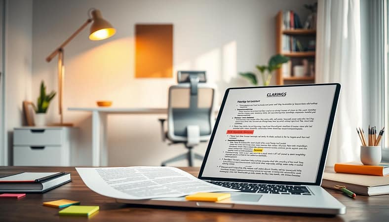
This principle extends to data. A wall of numbers is a fortress against understanding. A simple, clean table or chart is a welcome gate. It brings immediate order, allowing for comparison and insight at a glance. The right visual doesn’t just support your text; it elevates it, creating a multimodal experience that boosts retention and readability.
But let’s talk about the tools already in your word processor’s toolbar. Using bold, italics, and blockquotes strategically is the micro-economics of visual formatting. Used poorly, they’re just noise. Used well, they’re a conductor’s baton, guiding the reader’s eye and mind.
| Tool | Best Use | The Cognitive Effect |
|---|---|---|
| Bold Text | Highlighting key terms, definitions, or actionable takeaways. | Acts like a highlighter pen. It says, “This is non-negotiable. Remember this.” |
| Italic Text | Adding subtle emphasis, citing titles, or indicating a thought. | The whispered aside. It adds nuance and voice without shouting. |
| Blockquote | Setting off a powerful quote, a key statistic, or a foundational idea. | Gives a statement the stage it deserves. It creates visual and intellectual breathing room. |
The goal is concert, not cacophony. A bolded term introduces a concept. A few paragraphs later, an image illustrates it. A table organizes the evidence. A blockquote delivers the knockout punch. This layered approach respects the reader’s need for variety and significantly enhances readability by constantly resetting their attention.
Forget “woman laughing alone with salad.” Think like a documentary filmmaker. Every visual, every textual emphasis, must serve the narrative. When words and visuals work in concert, you don’t just share information. You create an experience that sticks.
Conclusion
Think of your last scroll through a dense Twitter thread or a cluttered news site. Your eyes glazed over. This shows the impact of bad formatting in the wild. We’ve looked at how it affects everything from headlines to white space, showing it’s not just decoration. It’s the structure of our thoughts.
Good writing structure is like a friendly tour guide. It guides us, saying, “Look here, breathe here, understand this next.” It makes sure we don’t get overwhelmed, whether we’re on a small screen or using a screen reader. This approach turns one-way messages into real conversations.
The aim is pure readability. It makes complex ideas seem simple and long articles feel quick. The UNC Writing Center says the best conclusions make readers glad they read the paper. Your formatting choices play a big role in this feeling.
So, here’s the final thought. Treat your paragraphs like valuable land. Use subheads as signposts. And don’t forget the importance of white space. In a world full of noise, elegant formatting is your quiet strength. It’s how your message stands out.