

That little computer in your pocket? It’s now key to your business success, just as getting solid offshore sportsbooks recommendations is key for savvy bettors. While you’ve been perfecting your website, Google has been judging it on mobile devices.
Here’s the truth: 62% of global traffic comes from mobile devices. And, 90% of shoppers use smartphones to research in stores.
Mobile-first indexing means Google treats your mobile site as the main character in this search drama. It’s not about shrinking your website – it’s about recognizing where your audience actually lives.
I’ve seen businesses stuck in the past, ignoring mobile users. Customers wave their smartphones past them. The irony is costly.
Adapting On-page Elements for Mobile
Remember when websites had “mobile versions” that felt like visiting your rich friend’s pool house instead of the main mansion? Those days are over. Responsive design isn’t just Google’s recommendation – it’s the architectural blueprint that prevents your site from becoming a digital IKEA furniture assembly nightmare.
I’ve seen dynamic serving go wrong more times than I’ve seen people actually read terms and conditions. Showing desktop versions to mobile users is like serving steak to vegetarians. And separate URLs? That’s maintaining two houses for the price of three, complete with canonical tag headaches that make tax paperwork look fun.
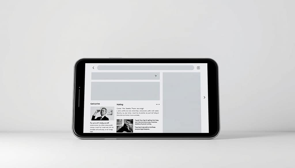
The beauty of responsive design is its elegant simplicity: one URL, one set of content, but with the CSS sophistication of a master tailor ensuring the suit fits whether you’re 6’5″ or 5’6″. It’s the digital equivalent of a well-cut suit that looks good whether you’re sitting or standing.
Google explicitly recommends responsive design as their preferred mobile configuration. Why? Because it serves the same URL and HTML to all devices, with CSS doing all the heavy lifting to adjust rendering. This approach creates a seamless experience that’s as smooth as a well-rehearsed Broadway performance.
| Configuration Type | How It Works | Key Benefits | Potential Drawbacks |
|---|---|---|---|
| Responsive Design | Same URL/HTML, CSS adjusts rendering | Single URL management, faster load times | Requires careful CSS implementation |
| Dynamic Serving | Same URL, different HTML per device | Device-specific optimization | Risk of misdirection, complex maintenance |
| Separate URLs | Different URLs (m.domain.com) | Complete mobile customization | Duplicate content issues, redirect headaches |
The practical benefits of responsive design read like a dream vacation itinerary: single URL management, reduced errors, less maintenance, faster load times without redirects, and efficient Google crawling. It’s the difference between having a personal concierge and trying to navigate a foreign city with a torn map.
While alternatives exist – dynamic serving (same URL, different HTML) and separate URLs (m. domains) – both come with significant drawbacks that could make your SEO strategy about as effective as a screen door on a submarine. Misdirection and duplicate content issues are just the beginning of the headache.
For those looking to dive deeper into mobile optimization strategies, our comprehensive guide on mobile SEO best offers additional insights and practical tips for ensuring your site performs beautifully across all devices.
The bottom line? Responsive design isn’t just the recommended approach – it’s the smart, efficient, and future-proof way to ensure your website doesn’t become another digital relic in the mobile-first era.
Testing Across Devices
Think your mobile-friendly site is good because Google’s tools say so? That’s like trusting a weather app while ignoring a hurricane. The real test is when real people use your site on actual devices.
Google’s Mobile-Friendly Test gives a basic check-up. But it’s like WebMD versus a real doctor. The Mobile Usability report in Search Console shows the truth about hard-to-tap targets and tiny fonts.

Speed matters. PageSpeed Insights might show a green score, but users might feel like it’s dial-up again. The Core Web Vitals – LCP, INP, CLS – check your site’s health. Large Contentful Paint (LCP) looks at loading speed, Interaction to Next Paint (INP) at responsiveness, and Cumulative Layout Shift (CLS) at visual stability.
Google Lighthouse does a full health check. But, tools can’t replace the real experience of using a phone in sunlight or with one thumb. That’s why testing on real devices is key.
Ever wondered what Googlebot sees on your mobile site? The Fetch as Google feature shows you. Also, your robots.txt file shouldn’t block mobile crawlers – it’s like hiding your best products.
The mobile experience is about making something that works in real life. It’s not just about passing tests. Being truly mobile-friendly means it works for real people using real devices.
Real-world Examples
Let’s dive into the real world of mobile SEO success. Seeing it in action is the best teacher.
Plaid’s EU website is like a digital Swiss Army knife. It does many things well without taking up much space. Their navigation bar is smart, hiding when you scroll.
But the real magic is in how fast it loads. Pages open in just 0.08 seconds. It’s like a quick tap on the screen.
Their content is structured like a Twitter thread:
- Easy-to-scan chunks for thumb-scrolling
- White space adds rhythm, not emptiness
- Tap targets are finger-friendly
They use schema markup in a clever way. It’s like adding subtitles for search engines with:
- FAQ schema for quick answers
- Article schema for featured snippets
- Breadcrumb schema for context
The site looks great on mobile without the desktop problems. No need for horizontal scrolling or squinting.
Plaid shows that optimization isn’t about removing things. It’s about making the most of what you have. Their site is a great example of how to do this.
Meta elements are also well thought out. Title tags and descriptions are short but engaging, perfect for mobile screens.
The key to mobile SEO success is understanding mobile users. They have different needs and ways of interacting.
Plaid’s site gets it right by respecting these differences. It offers high-quality content, just in a more fitting format.
Tools for Monitoring and Improvement
Think of mobile SEO tools as your digital Swiss Army knife. Semrush’s Site Audit tool digs into your site’s engine. It spots mobile SEO issues and suggests precise fixes.
Position Tracking shows how your mobile keywords rank against desktop. It’s like watching election polls shift in real time.
Google Analytics compares desktop and mobile traffic. You see which channels drive visits on smaller screens. PageSpeed Insights gives mobile speed tips.
A fast, mobile-friendly site keeps users from bouncing.
Google’s Mobile-Friendly Test checks if your site plays nice with phones. The Mobile Usability report in Search Console flags specific problems. Structured Data Markup Helper assists with schema.
Good schema can boost visibility in mobile search.
These tools help you build a responsive design. They ensure your site stays mobile-friendly as trends change. With AI Overviews taking more screen space, being cited matters.
Use these tools to adapt and stay ahead.