

Remember when SEO was all about stuffing keywords and hoping Google wouldn’t catch on? Those days are long gone.
Now, search engines are like super smart mind-readers that check if you’re making people happy. Google’s BERT and Helpful Content Updates told us to “Stop talking at your audience and start conversing with them.”
If your bounce rate is through the roof, search engines take notice. Websites with higher user engagement rates get better visibility. This is because they actually meet searchers’ needs.
This shift towards these metrics is not just a trend. It’s Google’s way of rewarding content that truly matters. They’re getting really good at figuring out if your audience cares.
Tracking and Measuring Success
If your analytics dashboard were a crime scene, engagement metrics would be the smoking gun. Forget Sherlock Holmes’ magnifying glass – we’ve got tools that would make even the greatest detective jealous.
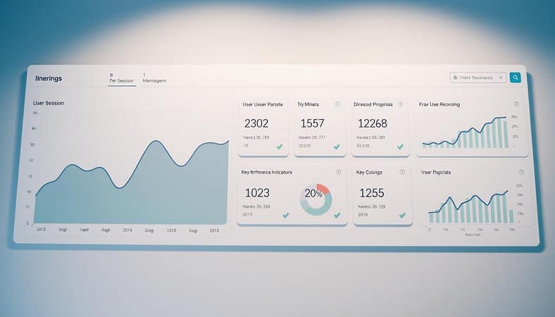
Google Analytics serves as your digital fingerprint kit. GA4 revolutionized tracking by replacing the outdated bounce rate with something actually meaningful: engagement rate. This calculates engaged sessions divided by total sessions, giving you real insight into whether visitors actually interact with your content.
Other critical SEO metrics tell compelling stories about user behavior:
- Pages per session reveals how compelling your content truly is
- Average session duration shows whether you’re holding attention or losing it
- Time on page indicates content quality and relevance
- Interactions per visit measures engagement depth
- Conversion rates prove whether your content actually drives action

Google PageSpeed Insights delivers the beautiful irony of the digital age: the company that wants to index all human knowledge gets genuinely annoyed if your site takes more than three seconds to load. Site speed isn’t just a technical metric – it’s the first impression that determines whether users stick around or bounce faster than a rejected prom date.
Google Search Console acts as your early warning system, monitoring search presence and identifying issues before they become problems. While SEMrush provides the toolkit for site audits and competitive analysis.
Watching heatmaps feels like observing users navigate sites while solving a Rubik’s Cube blindfolded. The patterns reveal everything from content engagement to navigation frustrations.
The real magic happens when you stop seeing numbers and start understanding behaviors. These SEO metrics transform from abstract data into actionable intelligence about what actually works for your audience.
Why haven’t you already built a shrine to your analytics dashboard? These tools provide the cheat codes to understanding user behavior in the digital matrix. The question isn’t whether you should use them – it’s how you’ve managed without them this long.
Tracking proper SEO metrics means moving from guessing to knowing. It’s the difference between throwing content at the wall hoping something sticks and understanding exactly what resonates with your audience.
Examples from Top Performers
Most brands see user engagement as a simple task. But the best ones treat it like a masterpiece. They dive deep into content analysis like Sherlock Holmes.
Pinterest made their site super fast. They cut down loading times so much it feels like teleportation. This led to a 15% boost in SEO traffic, showing the power of fast content.
The BBC saw mobile optimization as key to survival. They made mobile users happy, boosting engagement by 10%. Who knew making content easy to use could be so powerful?
Spotify uses advanced analysis to create perfect playlists. They know your mood better than your partner. This personal touch keeps you coming back for more.
Zillow turned house hunting into an interactive show. They improved the user experience, making sessions longer and bounce rates lower. It shows even boring tasks can be fun with the right design.
LinkedIn made professional networking exciting. They use personal content to keep users engaged. Even busy executives enjoy it.
ASOS made mobile shopping a breeze. They improved conversion rates and traffic by making it enjoyable. What a radical idea!
These examples show top brands focus on creating great experiences. They don’t just chase numbers. Their content analysis aims to keep users engaged.
Using Metrics for Continuous Improvement
Think of engagement metrics as your website’s personal trainer. They push for better performance. These metrics are not just numbers; they’re the key to your digital growth.
The journey begins with “metric triage.” First, find the big problems. Is your bounce rate sky-high? Are pages per session too low?
- Speed demon tactics: Make images smaller and HTTP requests fewer. Use CDNs quickly.
- UI/UX magic: Design for all devices. Navigation should be easy. CTAs should motivate action.
- Content that matters: Target your audience well. Use engaging formats. Keep content fresh.
Testing is where science meets art. Tools like Google Optimize let you test like a mad scientist. Try different headlines and layouts. Find out what works best.
Improvement is a never-ending cycle. It’s about constantly measuring and adjusting. The best sites keep improving, always listening to their metrics.
Your metrics tell a story. The question is: are you listening to what they say about your user engagement?
Integrating User Feedback into Strategy
Stop guessing and start listening. Your users are sharing what they want through their actions. It’s not just about adding comments. It’s about creating a digital space that meets their needs before they even know they need it.
Using SEO metrics and behavioral insights is key. I’ve seen companies use automations that help users in a smart way. It’s like having a personal assistant for your content strategy.
Our content analysis has changed from just keywords to creating detailed content universes. We focus on entity-based SEO, answering all user questions about a topic. This makes search engines understand content better, thanks to structured data.
When you use user feedback in your strategy, you’re not just pleasing algorithms. You’re creating something people want to use. This is what search engines value most. It’s a cycle of digital life that works beautifully.