
Many websites struggle with a common issue. They make great “hero” pages that rank well online. But these pages often don’t lead visitors to buy or sign up.
This is because a single page only captures one moment. It misses the whole search journey today’s buyers go through. Most research is done alone now.
Studies show buyers do over 60% of their research by themselves before talking to sales. Reaching them too soon feels pushy. Waiting too long means you’ve missed your chance.
The clues left during this research are called intent signals. Using keyword mapping to organize these signals is key. The method to connect them is intent stacking.
This method links queries from the start to the end of the buying process. It makes a clear path to conversion. Instead of hoping visitors find their way, you guide them through the search journey.
Categorize Terms: discover/compare/decide/support
Funnel mapping starts with sorting customer interactions into four key intent categories. It’s not about guessing what users want. It’s about understanding the clear signals they leave at every touchpoint.
Think of these categories as the foundation of your customer’s buying journey. Each one represents a specific intent with its own content needs. By mapping queries correctly, you guide users smoothly from problem awareness to solution use.
The four core categories form a complete progression:
- Discover (Early Research, Problem-Aware): Users spot a problem but don’t know solutions. They search for “signs you need CRM software” or “how to improve customer support.” This aligns with Top-of-Funnel (TOFU) content and Research Intent signals like educational articles.
- Compare (Solution Evaluation, Feature Analysis): Users know solutions exist and compare them. Searches like “best live chat software” or “HubSpot vs Salesforce features” show commercial investigation intent. This is Middle-of-Funnel (MOFU) where visits to review sites like G2 spike.
- Decide (Vendor Selection, Pricing Scrutiny): Users are ready to choose and need final validation. Searches include “Zendesk pricing 2024” or “Intercom free trial limitations.” This Bottom-of-Funnel (BOFU) stage shows Engagement Intent through repeated pricing page visits.
- Support (Post-Purchase Implementation): Users need help using what they bought. Searches like “how to set up Zendesk automations” or “ChatGPT API integration tutorial” indicate post-purchase needs requiring documentation and tutorials.
This categorization goes beyond traditional funnel thinking. You’re not just labeling stages. You’re identifying specific user questions that demand specific answers. Modern tools like Bombora intent data and Google Analytics reveal these patterns clearly.
For example, Research Intent signals might show a company consuming content about customer service trends for weeks. Then suddenly, Engagement Intent spikes with visits to software comparison pages. This transition from Discover to Compare is measurable.
Third-party review platforms provide another goldmine. When users spend time on G2’s software comparison platform comparing specific features, they’re deep in the Compare category. When they repeatedly click “visit website,” they’ve entered the Decide phase. This is how AI is reshaping how shoppers discover, compare, and shortlist products through intelligent signal analysis
The practical application is straightforward. Audit your existing search queries and user behaviors. Tag each with its primary category. You’ll quickly see gaps where you’re missing content for specific micro-intents.
Maybe you have plenty of Discover content but weak Compare materials. Or perhaps your Decide content lacks the pricing transparency users need. This gap analysis becomes your roadmap for intent stacking.
Remember: accurate funnel mapping requires looking at multiple data sources. Combine first-party analytics with third-party intent data. Review platform behavior with search query analysis. The complete picture emerges from these connected signals.
When done correctly, this categorization creates a precise map of your customer’s journey. You’ll know exactly what content they need at each micro-moment. This foundation makes the next step—building your content cluster—both logical and effective.
Build a 3‑Layer Cluster: pillar + compares + implementers + support FAQs
Intent stacking shines when you create a content cluster with clear layers. This setup turns your terms into a dynamic system that meets users at every step. It’s like building a machine that converts visitors into customers, with each part doing its job.
The heart of your cluster is the pillar page. It’s a detailed guide that covers your main topic. It acts as the main hub, linking to and from other content. The pillar page answers the first questions users have.
From this center, three key layers branch out, each for a different user need:
- Compares Content: This layer meets the “compare” intent. Users looking to decide are in the middle of their journey. Content like “Marketo vs. HubSpot” helps them weigh their options. It builds interest in your solution.
- Implementers Content: This layer caters to the “decide” and “do” micro-intents. It offers proof and practical advice. Case studies and detailed guides show how to achieve goals. This content makes it easier for users to start using your product.
- Support FAQs & Documentation: This layer is for the “support” intent. It includes detailed guides, help centers, and troubleshooting. Good documentation, like Tyk’s, keeps users happy. It answers specific questions and helps users succeed on their own.
This 3-layer model catches every user intent. A visitor might start with your “Ultimate Guide to SEO” (pillar), then check out a “Best SEO Tool Comparison” (compares). They might learn how to use Ahrefs in a “How to Conduct a Site Audit” guide (implementers). And they might look up “How to Fix Crawl Errors” in your support section (support FAQ).
Each piece of content is a dedicated spot for a specific micro-intent. Together, they form a system that guides users from start to finish. This cluster design makes your content strategy flexible and focused on the user.
Navigation & UX: breadcrumbs, sticky TOC, contextual CTAs
Imagine a visitor landing on a complex topic page. Without clear signposts, they are likely to leave. But with a structured internal linking path, they find their way to conversion.
This journey relies on three key UX elements. They turn separate pages into a single, converting experience.
Breadcrumbs are your first essential tool. They show the user’s location in your site’s hierarchy. A trail like “Home > Blog > SEO > Intent Stacking” does more than orient. It reinforces topic authority and offers a quick escape route to broader categories. This reduces bounce rates and supports a logical content flow.
A sticky table of contents (TOC) is key for long-form pillar content. It stays fixed on the screen as the user scrolls. This allows instant jumps to relevant subsections without losing place. For a detailed guide, a TOC empowers users to consume information at their own pace. It turns a daunting page into a navigable resource.
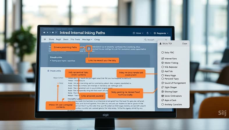
The most dynamic element is the contextual call-to-action (CTA). Generic “Contact Us” buttons fail because they ignore user intent. A CTA must match the page’s specific micro-intent. This turns browsing into progression.
Data shows CTAs within content are powerful for lead generation. A “Compare” page should offer a downloadable competitor matrix. An “Implementer” case study should link to a product tutorial. This strategic placement creates a natural internal linking path that feels helpful, not salesy.
These elements work together as a system. The table below outlines how each component supports the user journey.
| UX Element | Primary Function | Optimal Micro-Intent Match |
|---|---|---|
| Breadcrumbs | Visual orientation & hierarchy mapping | Discover, Compare |
| Sticky TOC | In-page navigation for detailed content | Decide, Support |
| Contextual CTA | Progression to next logical step | All Intents (context-specific) |
Implementing these features is not about decoration. It is about engineering conversion pathways. A visitor who starts with a “Discover” article can follow breadcrumbs to a “Compare” page. From there, a sticky TOC helps them digest details. A final CTA leads them to a “Decide” demo request. This seamless flow is the essence of a strategic internal linking path.
Mastering navigation and UX turns your content cluster into a guided tour. Every click has purpose. Every element reduces friction. This design directly influences assisted conversions and shortens the time to value for your audience.
Measurement: assisted conversions, path analysis, time to value
Measuring the impact of intent stacking goes beyond just counting conversions. It’s about understanding the whole search journey. The old method of giving credit only to the last touchpoint misses the mark.
It overlooks how your content works together at different stages of intent.
You need metrics that show influence, not just final actions. Three key measurements reveal intent stacking success. These are Assisted Conversions, Path Analysis, and Time to Value.
Assisted Conversions track which content pieces helped move leads forward. This metric answers a key question. Which blog posts or comparison pages influenced the sale before the final decision?
For example, a “what is” article might help weeks later. A “vs.” comparison could be the middle step. Tracking these assists shows your content cluster’s real power.
Path Analysis maps the common navigation sequences users take. It reveals patterns in how people move through your content. You see if users follow your intended journey from discovery to decision.
Path analysis might show that 60% of converters read three specific articles in sequence. This data proves your content architecture guides users effectively. It also highlights where journeys break down.
Time to Value measures how quickly leads move through your funnel. It tracks the reduction in sales cycle length. Shorter cycles mean your content answers questions faster.
This metric connects directly to business outcomes. Faster journeys mean lower acquisition costs and higher win rates. Time to Value shows if intent stacking compresses the buyer’s journey.
| Measurement | Traditional Focus | Intent Stacking Focus | Key Insight Provided |
|---|---|---|---|
| Conversions | Last-click only | Assisted + Last-click | Which content pieces influence decisions |
| User Path | Page views | Navigation sequences | How users move through intent stages |
| Sales Cycle | Overall length | Time between intent signals | Where content accelerates decisions |
| Lead Quality | Demographic scoring | Intent signal scoring | Which prospects are most ready to buy |
Real-world data proves these metrics matter. One case study showed dramatic improvements after implementing intent stacking. Marketing Qualified Lead to Sales Qualified Lead conversion increased by 38%.
The sales cycle shortened by 22%. This empirical evidence shows how acting on intent compresses the buyer’s journey. Prospects found answers faster and moved to decisions sooner.
Lead scoring models can incorporate these intent signals for predictive power. Modern systems add points for specific intent behaviors. For example, a third-party intent surge might add +20 points to a lead score.
These weightings become leading indicators of journey effectiveness. High intent scores correlate with sales readiness. Your sales team can prioritize leads showing strong intent signals.
This measurement approach transforms how you view content success. Instead of asking “did this page convert?” you ask “how did this page contribute to the search journey?” The answer reveals your content’s true business value.
Implementing these metrics requires proper analytics setup. Tag your content by intent stage and cluster. Configure multi-channel funnel reports in your analytics platform. The investment pays off in clearer insights and better decisions.
Optimization Loop: fill missing micro‑intents each month
Funnel mapping is a living process that gets better each month. It’s not a one-time task. It must keep up with how your audience makes decisions.
Every month, you need to find and fill gaps in your content. This means looking for micro-intents your content doesn’t cover yet.
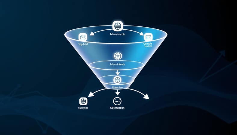
Every month, look for clues that show where your content is missing. Are visitors from review sites leaving on a certain page? Are you getting more questions about a specific feature? Has your audience’s software stack changed? These signs point to needs you haven’t met yet.
You have powerful tools to help you do this. Use both qualitative and quantitative methods to get a full picture.
- Customer Research: Look at support chat transcripts, survey answers, and poll data. Pay attention to what customers say and what they’re struggling with.
- Community Mining: Explore Slack groups, Reddit, and industry forums. Find out what questions keep coming up without clear answers.
- Intent Data Analysis: Keep an eye on your intent data platform for sudden topic spikes or new keywords with commercial value.
- Affiliate Keyword Gaps: Find commercial keywords that affiliates are using but your content isn’t.
This ongoing cycle turns your funnel mapping into a dynamic growth tool. Every month, you add new content to fix weak spots in your journey.
For instance, analyzing transcripts might show that decision-stage prospects are confused about integration details. Your next piece of content should address that specific micro-intent. This way, you make sure your entire buying committee gets the answers they need, right when they need them.
Stick to this monthly routine. By regularly addressing intent gaps, you capture more of the consideration phase. This makes your content smarter and more effective over time.
Templates: cluster map + CTA matrix
Your strategy needs a blueprint. These two templates turn theory into action.
The Cluster Map is your visual organizer. Plot your core topic as the central pillar. Around it, create four zones for the key micro-intents: Discover, Compare, Decide, and Support. Fill each zone with your existing and planned content. For Discover, use blog posts or product listicles. For Compare, use detailed guides like a “SaaS Platform Comparison.” For Decide, use case studies or pricing pages. For Support, use FAQ hubs.
This map shows where your content connects different user needs.
The CTA Matrix defines the internal linking path. It dictates where users should go next. A “Product Comparison” page serves the Compare intent. Its primary link should go to a “Case Study” for social proof. A secondary link should go to the “Pricing” page for the Decide intent. The CTA on that page could offer a “Competitor Analysis Guide.”
Each piece of content has a defined next step. This creates a guided journey.
Together, these templates synthesize everything. They combine intent categories, content types, conversion metrics, and UX principles. Use them to audit your current site. Identify gaps in your micro-intents. Plan new content that fills those gaps. Build a clear internal linking path that guides visitors from first question to final action.
Start mapping your intent-stacked journey today.